Table of Contents
- 1.The B2B Buyer Already Knows What They Want Before They Ever Talk to You
- 2.Most Companies Expect Way Too Much From Their Homepage
- 3.The Best-Designed Website I've Ever Heard Of
- 4.Hot Take: Every Audience You Serve Should Have Its Own Pillar Page
- 5.Why This Matters Even More in an AI Search World
- 6.What This Means for How You Should Redesign Your Homepage
- 7.The Bottom Line
- 8.FAQs
For years, I've told prospects and customers the same thing: making a website look pretty is easy. Getting it seen and getting people to convert once they get there - that's what the real promised land looks like.
AI search is making that gap wider by the month.
In the old days, a beautiful hero video or a slick product shot was enough to draw someone in. The job of the homepage was to wow you. Now? The job is more layered. We're designing for prospects to find us before they ever see the homepage, and then designing the homepage itself to do something most B2B sites still don't do well: get people to the right place, fast.
A pretty homepage that doesn't get found, and doesn't route people efficiently when it does, is just expensive wallpaper.
The B2B Buyer Already Knows What They Want Before They Ever Talk to You
Let me hit you with a stat that should reframe how you think about every page on your site:
67% of B2B buyers now prefer a rep-free buying experience, according to Gartner. Half of B2B software buyers start their research with AI chatbots like ChatGPT and Perplexity, per recent G2 research. And by the time a B2B buyer talks to sales, they've already completed roughly two-thirds of the decision-making process on their own.
Read those again. Slowly.
That means your homepage is no longer a sales pitch. It's not the moment of first contact. By the time someone actually lands on your homepage in 2026, they've probably already:
- Asked ChatGPT or Gemini a question about a problem
- Seen your name in an AI-generated answer (or not, but that's a different problem we'll come back to)
- Looked at your competitors
- Watched a YouTube video, lurked on Reddit, or read a peer review
- Formed an opinion about whether you're worth a deeper look
The homepage is no longer the front door. It's more like a help desk. And the people walking up to it are already mid-conversation with themselves.
Most Companies Expect Way Too Much From Their Homepage
Here's the trap I see B2B marketing teams fall into constantly: they try to make the homepage everything to everyone.
CMO needs to see a product story. Sales wants enterprise logos and a "Book a Demo" button. The product team wants to feature the new release. HR wants the careers link more visible. Someone in leadership wants a video of the founder. By the time everyone's gotten what they want, the homepage is a Frankenstein page that doesn't actually serve any one audience well.
I'll say this plainly: a homepage cannot be everything for everyone.
What it should be is the destination on your site that ranks for the broadest terms, orients your varied audiences the quickest, and gets them to where they actually need to be on your site in as few clicks as possible.
That's it. That's the job.
Its metric of success is not bounce rate. It's not time on page. It's how efficiently it gets your audience deeper into your website — to the content, product page, case study, or pillar that actually answers what they came for.
The Best-Designed Website I've Ever Heard Of
Back in the early 2010s, I was at some marketing event and somebody asked me what I thought the best-designed website on the internet was. I answered with some cool ecommerce brand I'd seen on Instagram. Beautiful photography. Custom typography. The whole bit.
The guy I was talking to didn't even pause. He said: "Craigslist."
I almost laughed. Then he explained it.
With limited clicks, he could get exactly where he wanted to go. Apartments in San Francisco. Used trucks in Phoenix. A guitar teacher in Brooklyn. The design wasn't pretty, but it was perfect because the entire job of that homepage was to fork users into their right destination immediately. No carousel. No video. No "Our Story." Just paths.
I think about that conversation almost weekly. Especially now.
The AI-era homepage isn't supposed to be Craigslist. You still need brand, you still need positioning. But the spirit of it is dead-on correct. Your homepage is a portal, not a destination. Its design should be measured by how fast a stranger can self-identify and find the right next step.
Hot Take: Every Audience You Serve Should Have Its Own Pillar Page
Here's where I'm going to lose some of you, but stay with me.
If your homepage is the portal, then the real conversion-drivers of your site - the ones that actually convert, rank, and build relationships - are dedicated pillar pages for each audience you serve.
A pillar page is a centralized hub that speaks exclusively to one audience and addresses everything they'd care about across their journey down the funnel. Top-of-funnel education. Mid-funnel comparison. Bottom-of-funnel proof. All on one anchor page, with smart internal links to deeper content.
If you serve CMOs, build a CMO pillar. If you serve heads of operations at manufacturing companies, build that pillar. If you have three core verticals you sell into, that's three pillars, not three homepage carousel slots.
When those pillars are really strong, here's what happens:
- Most of your users bypass the homepage entirely. They land directly on the pillar from an AI answer, a Google search, a LinkedIn post, or a paid ad and they're already in the right environment.
- Your internal linking gets smarter. Pillar pages become natural hubs that link out to supporting blog content, case studies, and product pages. That builds topical authority, which is the language Google and LLMs both speak now.
- User paths get cleaner. Instead of one homepage trying to route eight different audiences, each audience has a curated path designed just for them.
- Your content strategy stops being a graveyard. Every new piece of content has a logical home - it nests under a pillar instead of floating in a category like "Insights" that nobody navigates to.
The homepage's job, in this model, becomes much simpler and much more achievable: rank for your most generic brand and category terms, identify the visitor, and route them to their pillar. Done.
Why This Matters Even More in an AI Search World
The reason context-driven architecture wins now — and the reason keyword-only thinking is dead — is because LLMs don't just look at one page. They look at the relationships between your pages.
When ChatGPT or Perplexity is deciding whether to cite your site as an authoritative source on, say, "revenue operations for mid-market SaaS," it's not just reading one blog. It's evaluating whether you have an actual body of work on that topic. Are there pillar pages? Do they link to deep supporting content? Does your site demonstrate that you live in this conversation, not just that you wrote one post about it?
A homepage trying to be everything signals nothing. A homepage that quickly fans out to deep, audience-specific pillars signals expertise.
This is exactly the shift from a keyword world to a context world. Our model, ATAKSearch, helps B2B teams understand how their site is being seen, cited, and surfaced across AI platforms, then builds a content strategy that earns visibility in a context-driven environment. Because rank tracking alone won't tell you whether you're showing up in the answers that actually matter.
What This Means for How You Should Redesign Your Homepage
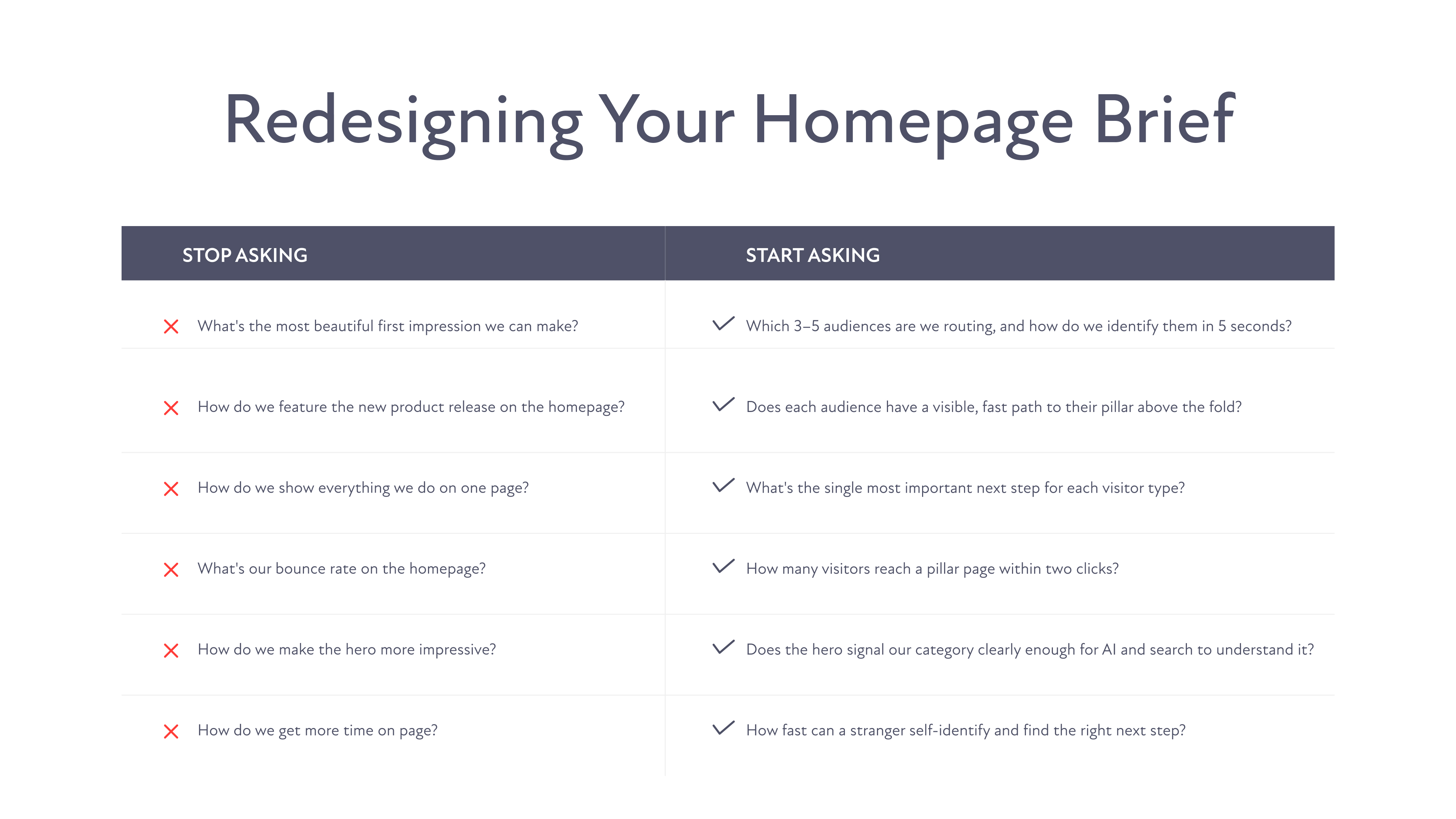
If you're staring at your homepage right now thinking, "okay, what do I actually do with this?" — here's how I'd reframe the brief.
Stop asking: What's the most beautiful first impression we can make?
Start asking: Which three to five audiences are we trying to route, and how can we identify them in five seconds?
That probably means:
- A hero that signals the broad category you compete in, clearly enough to rank and clearly enough that AI models can confidently associate you with it
- Visible, fast paths to each audience pillar (above the fold, not buried in a mega-menu)
- Social proof that's broad enough to validate trust, but not so dense that it slows the route
- A footer that does heavy lifting on long-tail navigation
- And, yes, brand — but brand in service of clarity, not in competition with it
You don't need to nuke the beautiful hero image. Keep it. But understand that its job has changed. It's not selling anymore. It's orienting.
The Bottom Line
The homepage of 2026 isn't a billboard. It's a switchboard.
Most of your buyers won't even hit it first. They'll arrive at a pillar or a blog from an AI answer or a smart search query. And when they do hit the homepage, they're not asking to be impressed - they're asking to be routed.
Design for that, and your homepage starts pulling its weight again. Try to make it do everything, and it'll keep underperforming no matter how pretty the redesign looks.
If you want to understand how your homepage and pillar pages are actually performing in AI search — what's getting cited, what's getting missed, and where your competitors are eating your lunch — that's exactly the kind of visibility we build with ATAKSearch.
FAQs


