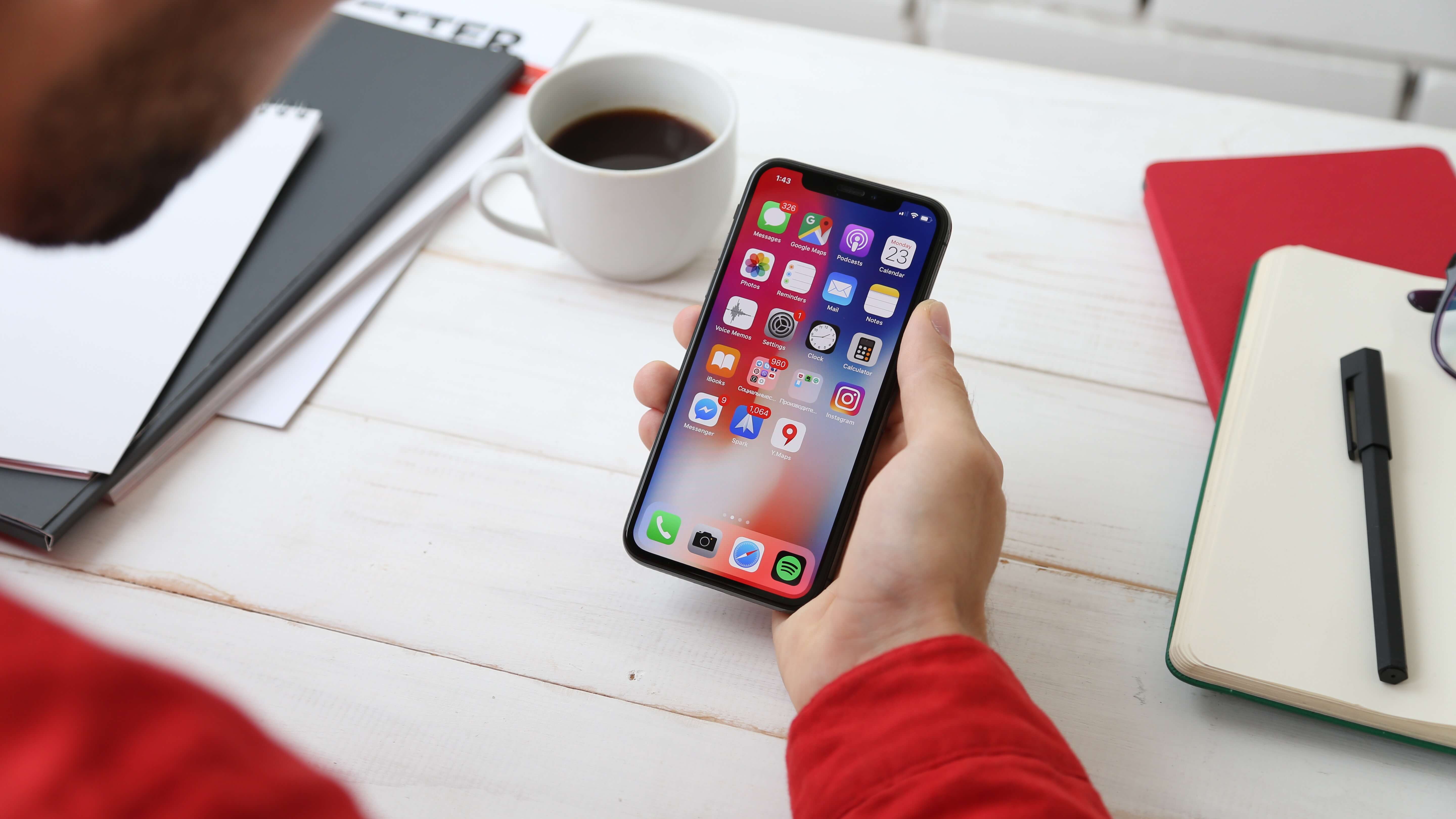
As the world becomes increasingly mobile-centric, businesses must adapt their digital strategy to meet the needs of mobile users. Mobile-first UI/UX design is a crucial aspect of this adaptation. In this blog, we'll delve into the importance of mobile-first design and guide you through the best practices to implement it effectively. Whether you're a designer or a business owner, this blog will provide valuable insights on how to create a user-friendly mobile experience.
The Importance of a Solid Derivatives Marketing Plan
A solid derivatives marketing plan begins with a clear understanding of your target audience and their needs. It is crucial to conduct thorough market research and analysis to identify your ideal customers and their preferences. This information can help you tailor your marketing efforts to resonate with your target audience and increase your chances of success.
Another crucial aspect of a successful derivatives marketing plan is messaging. Your messaging should be clear, concise, and relevant to your target audience. You should focus on the benefits and value of your products, rather than their features. This can help you differentiate your products and communicate their unique value proposition effectively.
Introduction to Mobile-First UI/UX Design

In recent years, mobile devices have become the primary way people access the internet. As a result, designing user interfaces (UI) and user experiences (UX) with a mobile-first approach has become increasingly important. Mobile-first design involves prioritizing the design and development of a website or application for smaller screens and mobile devices, before moving on to larger screens.
One of the key benefits of a mobile-first approach is that it encourages designers to simplify and streamline their designs. With limited screen real estate, mobile designs require prioritization of essential information, while non-essential information can be hidden behind menus or shown only when necessary. This leads to a cleaner, more user-friendly design that is easy to navigate.
Another advantage of a mobile-first approach is that it forces designers to focus on performance and speed. Mobile devices have limited processing power and slower internet speeds, so designers must optimize their designs for quick load times and minimal data usage. This can be achieved through techniques such as minimizing file sizes, caching data, and reducing the number of HTTP requests.
A mobile-first approach also supports responsive design, which means that a website or application will adjust its layout and content to fit any screen size or device. This ensures that users have a consistent experience across all devices and can access the same content and functionality regardless of the device they are using.
Why Mobile-First Design is Crucial for Modern Businesses

Mobile-first design is an approach to web design that prioritizes the mobile user experience. It involves designing a website or application for small screens first and then scaling up to larger screens. This design philosophy ensures that the user experience is optimized for mobile devices and can adapt to larger screens.
There are several reasons why mobile-first design is crucial for modern businesses. Firstly, mobile devices have surpassed desktop computers as the primary source of internet traffic. This means that businesses that prioritize mobile-first design are better equipped to cater to a larger audience.
Secondly, Google's mobile-first indexing algorithm has made mobile-first design an essential aspect of search engine optimization (SEO). This algorithm crawls and indexes mobile versions of websites first, and then desktop versions. As such, businesses that prioritize mobile-first design are more likely to rank higher in search engine results.
Thirdly, mobile-first design can enhance the user experience. Mobile devices come with unique features such as touch screens, location-based services, and voice commands. Mobile-first design takes advantage of these features to create a more engaging and personalized experience for users.
Finally, mobile-first design can lead to increased conversion rates. With more people using mobile devices to make purchases, businesses that prioritize mobile-first design are more likely to convert mobile users into customers.
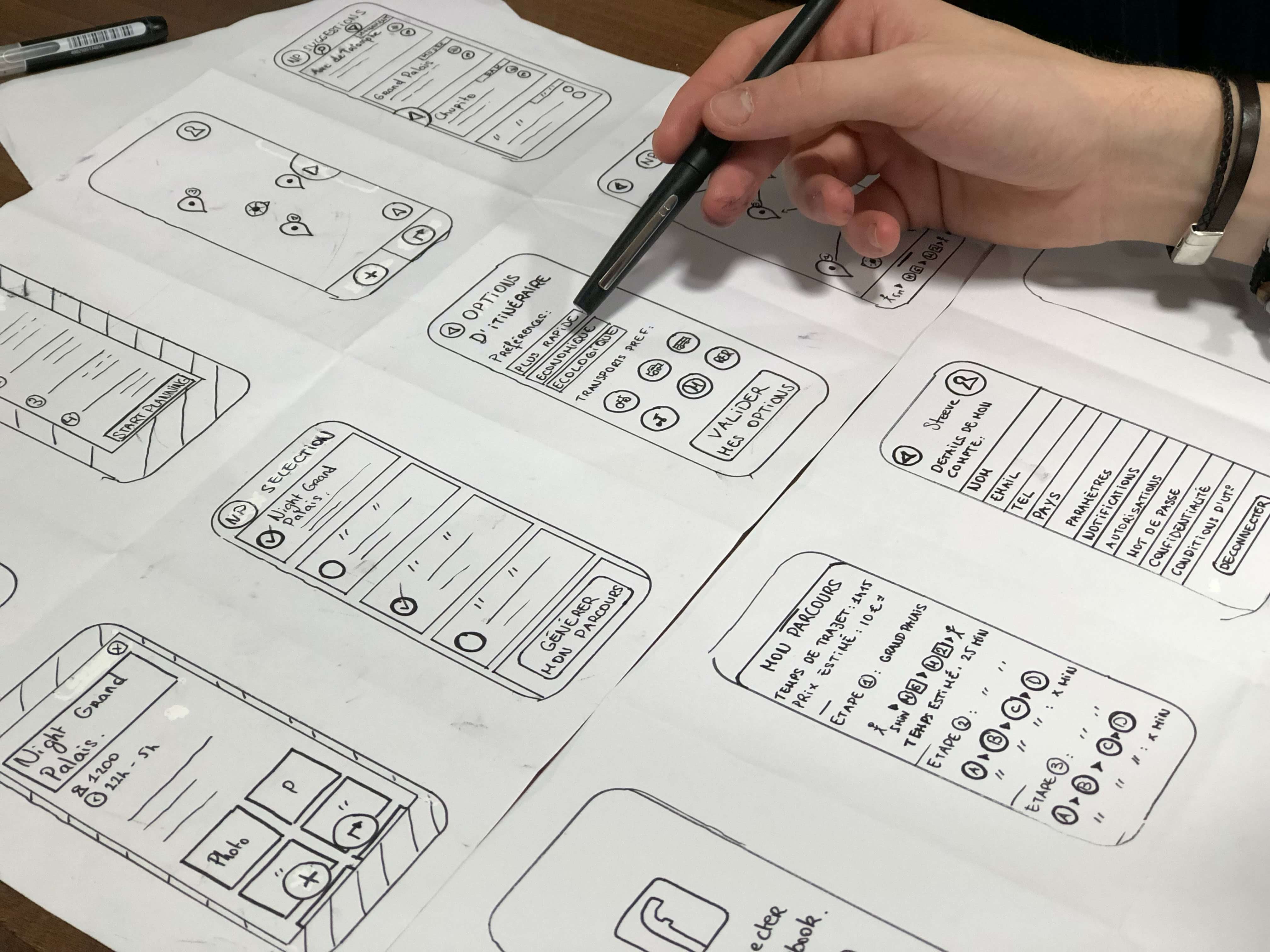
Key Principles of Mobile-First Design
With more and more people accessing the internet through their mobile devices, mobile-first design has become a crucial aspect of modern web design. In this article, we will discuss the key principles of mobile-first design.
Prioritize the User Experience: the user experience is the most crucial aspect of mobile-first design. As such, designers must ensure that the user interface is intuitive and easy to use. One of the best ways to achieve this is by simplifying the design and removing unnecessary elements. A clean and simple interface can make it easier for users to navigate the website or application.
Optimize for Mobile Devices: designers must optimize the website or application for mobile devices. This involves designing for small screens, using a responsive layout, and optimizing load times. Mobile devices have limited screen real estate, so designers must prioritize the most critical information and functionality.
Use Mobile-Specific Features: mobile devices have unique features such as touch screens, location-based services, and voice commands. Designers should take advantage of these features to enhance the user experience. For example, using swipe gestures to navigate through the application, or using location-based services to suggest nearby restaurants or stores.
Ensure Consistency Across Devices: while mobile-first design prioritizes the mobile experience, designers must ensure that the website or application is consistent across all devices. This involves using a responsive design, which adapts to different screen sizes and resolutions. Consistency ensures that users have a seamless experience, regardless of the device they are using.
Test and Iterate: designers must test and iterate their designs to ensure that they meet the needs of their users. Testing involves gathering feedback from users, analyzing user behavior, and making changes based on the data. By iterating the design, designers can continuously improve the user experience and ensure that the website or application is always up to date.
Creating an Effective Mobile-First Design Strategy

In today's digital age, mobile devices have become the primary source of internet access for many people. As such, creating an effective mobile-first design strategy has become essential for businesses and organizations that want to engage with their audiences online
Identify Your Target Audience
Before creating a mobile-first design strategy, it's essential to identify your target audience. This involves understanding their needs, preferences, and behaviors. By understanding your audience, you can create a design that meets their needs and preferences.
Define Your Goals
Defining your goals is crucial when creating a mobile-first design strategy. Are you looking to increase engagement, drive sales, or build brand awareness? Once you define your goals, you can create a design that supports them.
Use Responsive Design
Responsive design is a key element of mobile-first design. This design approach ensures that your website or application is optimized for different devices and screen sizes. By using responsive design, you can ensure that your design looks great on any device.
Prioritize Content
When designing for mobile devices, it's essential to prioritize content. Mobile devices have limited screen real estate, so it's crucial to prioritize the most critical information and functionality. This involves simplifying the design and removing unnecessary elements.
Optimize Load Times
Mobile users have limited patience when it comes to waiting for a website or application to load. Therefore, optimizing load times is crucial when designing for mobile devices. This involves optimizing images, using caching, and minimizing code.
Best Practices for Mobile-First UI/UX Design
Mobile-first UI/UX design has become essential in today's digital age as more and more users access the internet through their mobile devices. Creating a design that prioritizes mobile users requires a different approach compared to designing for desktop users.
Prioritize the User Experience
The user experience should be the top priority when designing for mobile devices. A simple and intuitive design can make it easier for users to navigate your website or application. This involves using clear and concise language, ensuring that the design is easy to navigate, and minimizing the number of clicks required to access essential information.
Optimize for Mobile Devices
Designers must optimize the design for mobile devices, taking into account the small screen size and the need for fast loading times. This involves using a responsive design that adapts to different screen sizes and resolutions, minimizing the number of images and multimedia content, and using a font size that is easy to read on mobile devices.
Use Consistent Design
Consistency is crucial when designing for mobile devices. The design should be consistent across all pages and features, ensuring that users have a seamless experience as they navigate your website or application. This involves using the same color palette, font style, and layout across all pages and features.
Use Mobile-Specific Features
Mobile devices have unique features such as touch screens, location-based services, and voice commands. Designers should take advantage of these features to enhance the user experience. For example, using swipe gestures to navigate through the application or using location-based services to suggest nearby stores or restaurants.
Prioritize Content
Mobile devices have limited screen real estate, so designers must prioritize the most critical information and functionality. This involves simplifying the design and removing unnecessary elements. By prioritizing content, designers can create a design that is focused and effective.
Test and Iterate
Testing and iterating the design is crucial when creating a mobile-first UI/UX design. By testing the design with users and analyzing their behavior, designers can identify areas for improvement and make changes that support the user experience.
Optimizing Mobile-First Designs for Different Devices
One of the main challenges of mobile-first design is designing for different devices. Smartphones, tablets, and laptops all have different screen sizes, resolutions, and operating systems. Designers must optimize their designs for these different devices to ensure a consistent user experience across all platforms.
Responsive design is a key element of mobile-first design that helps designers optimize their designs for different devices. Responsive design ensures that the design adapts to different screen sizes and resolutions, ensuring that users have a consistent experience across all devices. This involves using fluid layouts, flexible images, and media queries to adjust the design based on the device's screen size.
Designers must also consider the different operating systems that mobile devices use. Android and iOS, for example, have different design standards and guidelines that designers must follow to ensure that the design is optimized for the specific operating system.
Another factor to consider when optimizing mobile-first designs for different devices is load times. Mobile users have limited patience when it comes to waiting for a website or application to load. Therefore, designers must optimize load times by minimizing the number of images and multimedia content and using caching to improve load times.
Finally, designers must test and iterate their designs to ensure that they are optimized for different devices. By testing the design with users and analyzing their behavior, designers can identify areas for improvement and make changes that support the user experience.
Conclusion: Embracing Mobile-First Design for a Better User Experience
Embracing mobile-first design is essential for businesses and organizations that want to engage with their audiences online. Optimizing mobile-first designs for different devices involves using responsive design, considering different operating systems, optimizing load times, and testing and iterating the design. By following these best practices, designers can create a design that meets the needs of mobile users and provides a better user experience across all devices.
Related Posts

How UI/UX Design Trends Are Shaping the Future of User Experience
User Experience (UX) and User Interface (UI) design are critical components of creating digital products that users enjoy using. Over the years, these…
How can a UI/UX Agency Impact My Business and Improve Our Customer Behavior?
In today's world, a strong online presence is crucial for the success of any business. One of the key factors that can make or break your online presence…
The Top AI-Powered Tools You Need to Know About Graphic Design
Artificial intelligence (AI) has become a game-changer for many industries, including graphic design. AI graphic design tools utilize machine learning and…