Consider your homepage the entryway to your online business. Here, you have the fleeting opportunity to impress upon your visitors… pretty much everything about your company. From the abstract (your brand personality and values) to the tangible (current promotions), every element on your homepage can stand to be optimized through A/B tests so that potential customers get the most out of their first visit.
In this post, we’ll guide you through some of the options worth implementing on your site’s homepage elements. Keep in mind that since the homepage is far on the sales funnel from the final purchase, the measure of success for a well-optimized homepage isn’t necessarily increased revenue, but lowered bounce rates, increased product page views, increased click-throughs, and so forth — essentially, any additional activity from the homepage onward indicates a win.
Starting From the Top
The header on your homepage is where you’ll find your logo and navigation. Run a few A/B tests on the placement of your logo. Will it go at the top right, center, or left? This may not seem like a change that will garner statistically significant results, but see if these variations make a difference in average time a user spends on your site.
Testing your search bar language is quick and easy so don’t ignore the opportunity to improve your site’s activity. Indicators of the success of this test can include increased product page views and increased average order value (AOV) due to the customer shopping for products that they hadn’t previously considered.
Take this example from Backcountry:
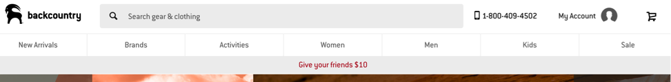
You’ll notice that the tabs go from what’s most profitable (new arrivals), onto serving customers who are looking for something specific (brands, then activities), then by broad categories for those who want to shop around (activities, women, men, kids), and then to the category of products that’s less desired and least profitable (sale).
What pages on your site do you want people to navigate to the most? Dedicate your header navigation to those pages and monitor the traffic you get on them. Based on the data in your findings, you can then move the tabs around to better serve your customers’ interests.
Also on Backcountry’s header is a search bar. If you’re planning to include a search bar in your header, think about the verbiage on it. What you say in your search bar could be the push that a customer needs to keep on shopping. In Backcountry’s case, their search bar language, “Search gear and clothing” tells the customer what type of products they sell thus serving a functional purpose.
However, search bar language can vary. Consider these alternatives:
- Inspirational
 Product Specific(this can be used as an opportunity to suggest some of your current best-sellers!)
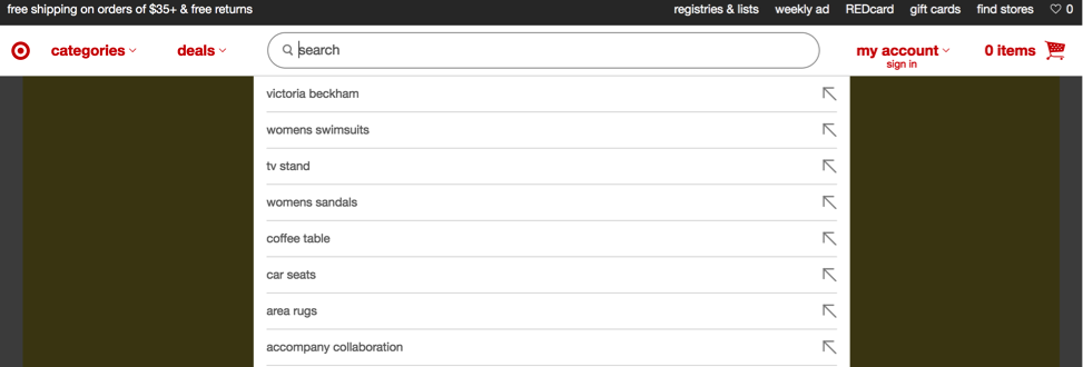
Target uses a dropdown in its search bar to showcase its product selection:
A/B testing your search bar language is quick and easy so don’t ignore the opportunity to improve your site’s activity. Indicators of the success of this test can include increased product page views and increased average order value (AOV) due to the customer shopping for products that they hadn’t previously considered.
Above the Fold Content
“Above the fold” refers the space on a webpage that a visitor can see without having to scroll down. This is prime real estate for you to populate with captivating content.
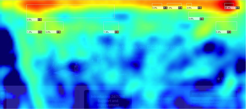
In recent years, we’ve found rotating homepage sliders don’t work. They don’t garner more clicks, they either move too fast or too slow for the user to retain any valuable information, they aren’t compatible with or require too much loading for mobile (loading those huge images takes a lot of data!), or they’re even ignored by users due to their overabundance.
This website’s heat map shows its slider being left in the cold (heat maps show where clicks happen on a page):
 So what does work? Run some A/B tests and find out. Take our website for example:
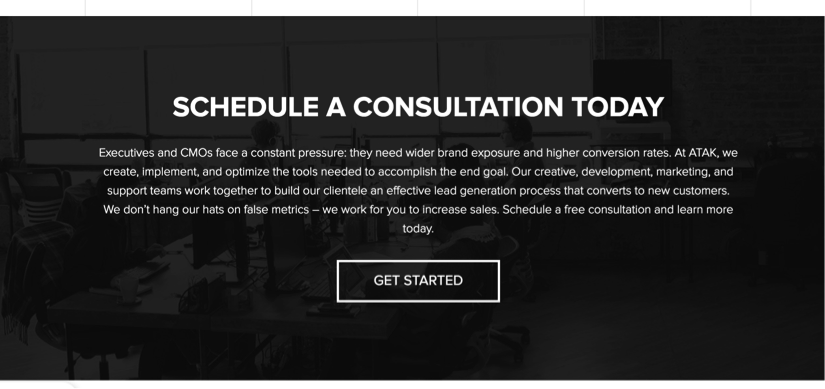
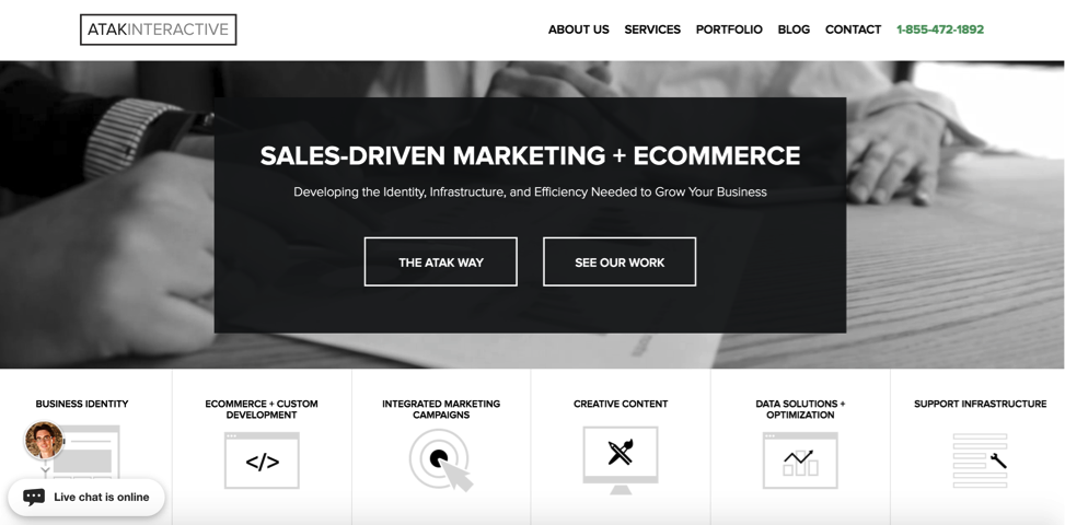 We use a short gif-like video as the background (but a still image works to the same effect) with a few lines of text that communicate our value, and two call-to-actions (CTA) that prompt the user to take the actions that we find most valuable at this point of the sales funnel: reading more about us and looking through our past work.
Test the image and language on your homepage header of your site. Will it be an aspirational image that acts as background to the words, or will it be more direct and promote current best selling products and promotions? Will it feature targeted content based on the customer’s demographic profile (yes, this can be done.)? When testing, reduced bounce rate means it’s working.
Furthermore, what will your call-to-action(s) be and where will it be placed? Test the possibilities to see what gets the most clicks.
You’ll also see that on our homepage, we didn’t devote the entire above-the-fold space to the hero image. Each of those squares underneath the hero image serves a functional purpose by further communicating what we do. They each link to their own page.
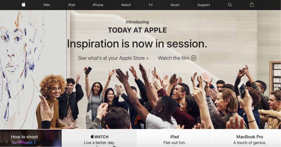
Apple cheekily does the same thing, using the space beneath the hero image to highlight their popular products:
If you’re going for a similar set-up, test out what works best occupying that sliver of space. Again, increased click-throughs indicate a win.
For all of these tests, install a heat map tool to see where users are clicking. You may think buttons are clear to find, but often they are not.
Below the Fold
How else are those boxes underneath the hero image handy? They encourage scrolling. That’s right, showing only the top of those boxes above the fold wasn’t without motive. They’re there to encourage you to scroll down and see what else the homepage has to offer.
Below the fold, test content that’s secondary in importance but still worthy of display. Retail stores often highlight current promotions or featured products.
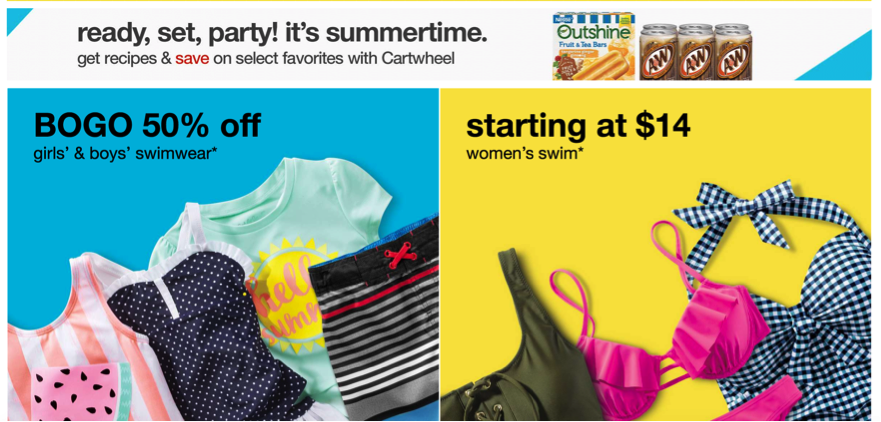
Target’s immediate “below-the-fold” content is seasonally geared:
As you scroll further down, they gear content towards your demographic information: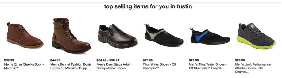
On our site, we expand on your business’ value.
Evernote alternates the placement of its copy and image from left to right to encourage movement of the eye and scrolling down the page.

In each case, Target, ATAK, and Evernote didn’t miss the opportunity to include a call to action at the bottom of their “below the fold” content and neither should you. “The fold” doesn’t mean that no one sees what’s beneath it. As long as you keep the content interesting, everyone scrolls. If the content is interesting enough, they’ll click.
Here are some other examples of what you can put below the fold:
 Testimonials.
Blog.

Social Media Feed.

Footer
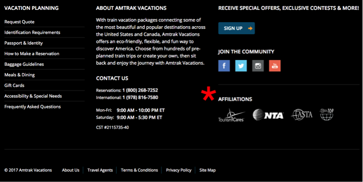
Content in the footer stays pretty uniform between different websites. The standard features are an email sign-up, contact information including address, social links, site directory, and “fine print” information like privacy and/or store policy information, and copyright.

Other ideas to put in the footer:
- Security logo for extra reassurance.
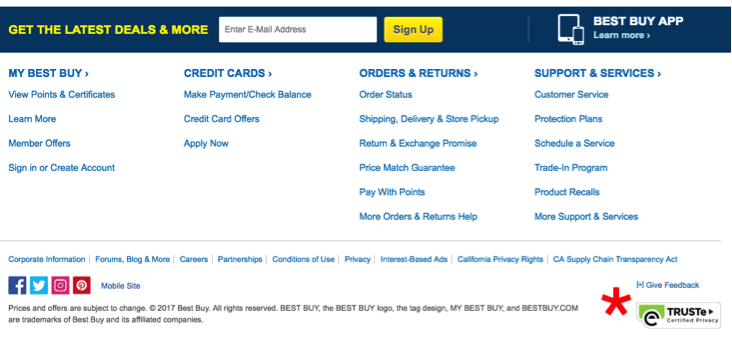
- Awards your company received.
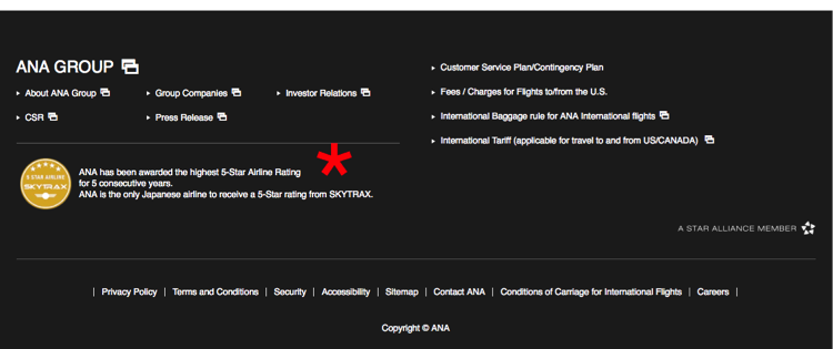
- Any associations or affiliations that you’re a part of.
Think from the perspective of someone who can’t find what they’re looking for. The footer should have sufficient information to point them in the right direction. If you’re curious about how far down your visitors scroll on your site, an effective heat map will give you some perspective — the numbers may be greater than you think!
Be sure to add one last call to action in the footer to see what works and what doesn’t.
Remember, first impressions matter and thus, a lot of emphases is placed on the look, feel, and function of your homepage. These A/B test ideas can add up to a whole lot of value for your business. For more guidance on crafting the perfect homepage, contact us for a free website audit.